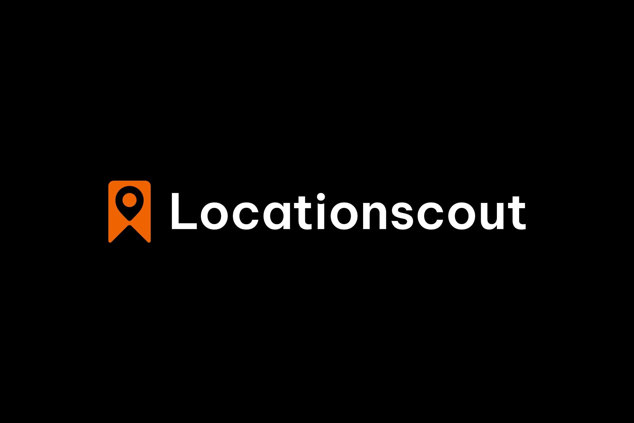
After almost 10 years it was finally time for a professional logo and as a result of months of work, I'm pleased to finally reveal the new design and some backstory.
The logo was designed by the one and only Yup Nguyen, who is one of Vietnam's best designers. I couldn't have been happier that he had the time to do this project with me and you might know him already from the beautiful animations he designed for our home-, app-, and the premium-page.

I'm a little sad to say goodbye to the old logo, but I'm all the more pleased with the new one.
While the old logo was done quickly back in 2014 just to have something while getting the first prototype of the platform online after weeks of non-stop work, the new logo was carefully designed to match what this community is actually about - finding, sharing, and enjoying these beautiful places to create and remember ("bookmark") memories for a lifetime. But it's also about bookmarking your favorite spots or hiking to this special place at the top of a mountain (if you only look at the dark parts of the logo) while leaving your comfort zone and overcoming your personal hurdles.
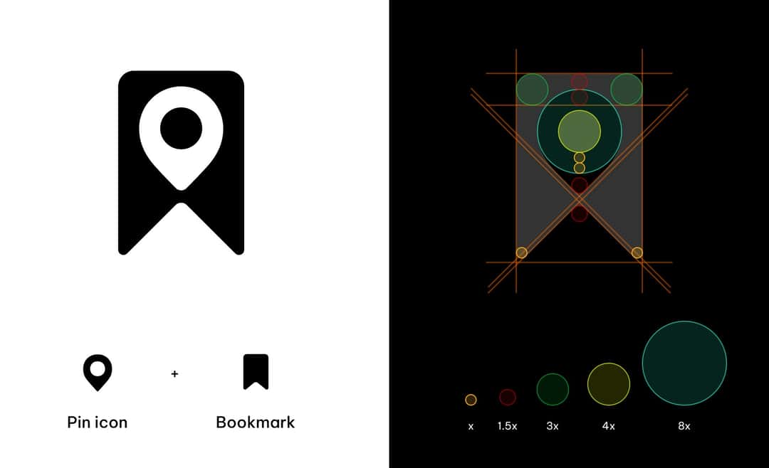
Designed into the last detail to match the high-quality standards of Locationscout.
I simply love tiny details or easter eggs most of the users will never discover. Yup had the great idea to individualize the "i" of the font, which now represents the community. It's also a reference to my first startup I launched in 2002 where the logo contained 3 of these users. If you don't have a profile photo here on Locationscout you will have a part of my old logo as your profile, another easter egg for those who knew the platform I founded before.
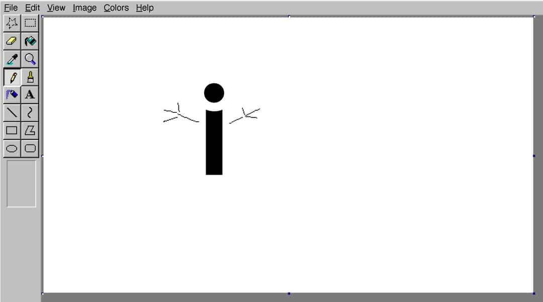
I quickly visualized the idea of including you as a user in the "i" of the logo in a professional way. ;-)
We even have a realistic 3d version of the logo now which will probably be the new app icon. Which one do you like more? Flat and simple or realistic with more details?
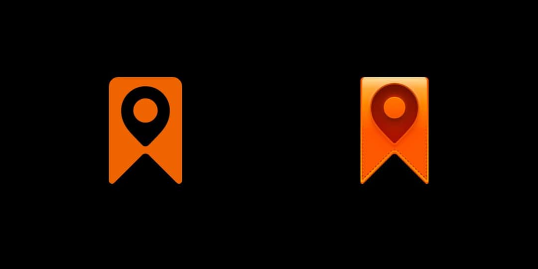
Which one do you like more as our new app icon?
But wait, there is even more...
If you checked the What's New-page you might have seen it already. At the end of January, we moved the entire platform to a **new and highly scalable infrastructure** to keep usage stable even in times of high traffic. I am saying "we" because Tim and Stephan helped me as freelancers with their deep knowledge of how to build this in the best possible way. So in the end Tim especially deserves the applause for the smoothest relaunch of the platform with 0 seconds of downtime while Stephan and I are already working on improving the speed of the platform again with quite a few pages already loading 20-30% faster right now.
After many weeks of hard work, I was finally happy with the high quality of the new weather dashboard in the iOS and Android app, which helps you decide when to visit a spot or move to another one based on real-time weather conditions. The time zones in particular have been a bit of a headache, but I wanted it to be as perfect as possible before I shared it with you. I've even included a tiny note at the bottom showing the local time so you're not as confused as I was a few times.
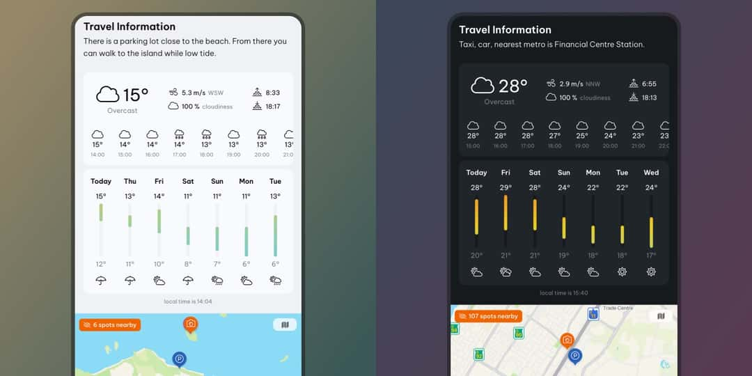
The new weather feature in the iOS and Android app, beautifully designed to look great in light and dark mode to match your preference.
Your opinion
I have a lot of new features and improvements planned for this year to keep this the best possible platform for you. What I care about the most though is your honest opinion and I would love to hear from you via email (contact@...) or directly in the comments below. Is there any feature missing or something you would like me to work on? Thank you so much to every Premium subscriber for your financial support. It means the world to me and this platform wouldn't be possible without you. If you are not Premium yet, please consider supporting this platform to secure further development and maintenance.


Comments (17)